This project was a brand revamp. The client wanted to clean up her current branding from feeling "homemade" to more of a modern, wholesale feel. This project called for an improved logo, a dedicated color palette, and a typography pack, along with a new label layout.

Before

After

On the right, you can see the original branding with the "homemade" feel the client wanted to phase out.  
The 'U' was a boxier candle, with some slight imperfections, but ultimately the U is the symbolic icon that customers had come to recognize Curly's branding by. Being an important element, it needed to be adjusted accordingly, without completely losing brand recognition. I rounded it out, cleaned up the lines, and added color to the flame from the brand color palette that I also created (below).

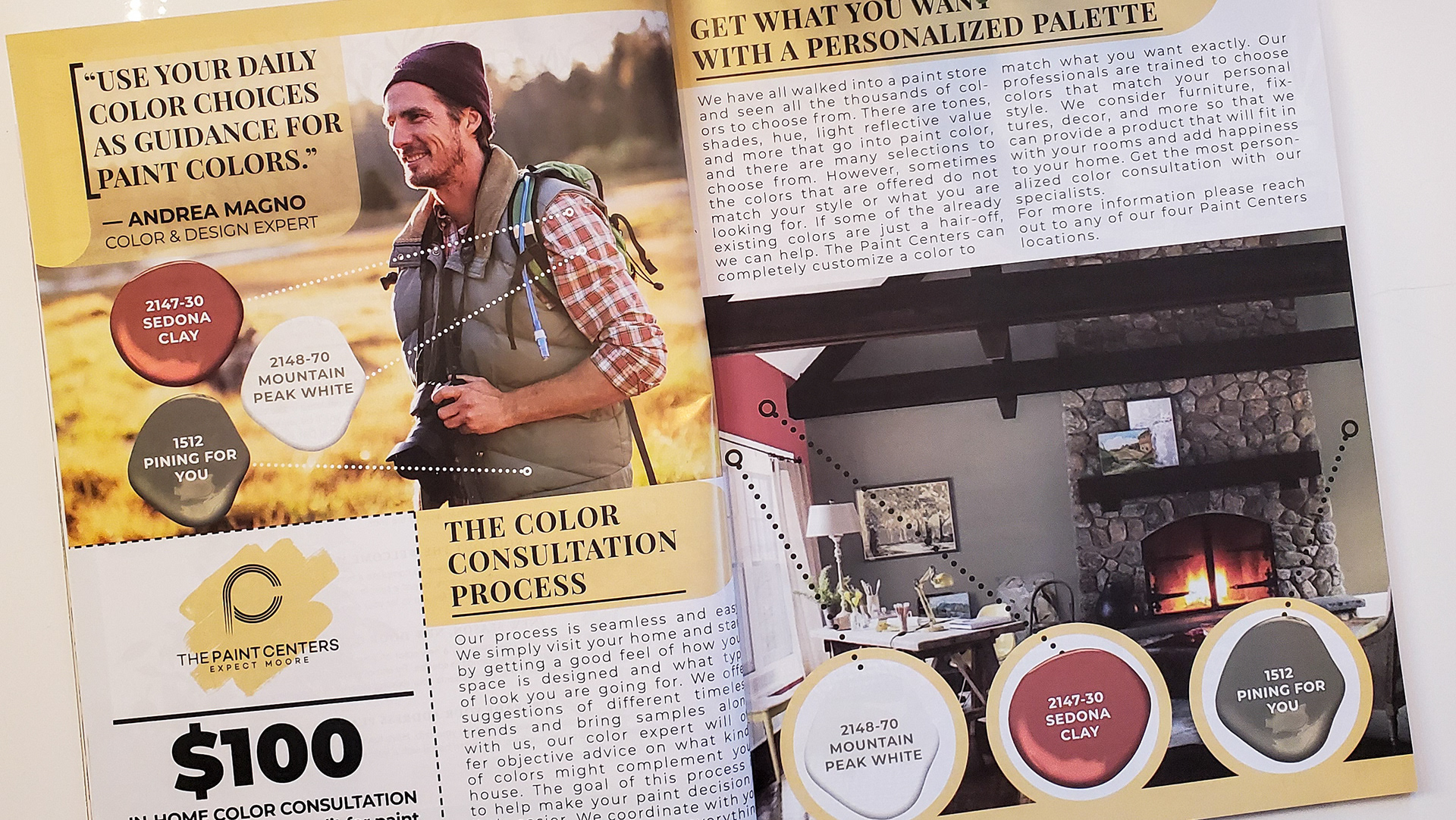
Custom dedicated color palette, inclusive of unique names, and including all color codes needed to apply to designs across multiple platforms. CMYK, RGB, and Hex codes.

For the label, I went with a minimalistic, modern design and emphasized the familiar 'U' candle symbol. I went with all lowercase on everything except the title and logo to add an element of clean consistency and create less strain for the eyes.

This is a label I created for the client to commemorate her 5th year anniversary of making candles. This label was used on a set number of candles and sold as a limited edition scent. I incorporated the color palette I created previously. The wavy element on the right side is a nod to her previous branding, which was known for its Kraft brown labels.

You may also like

Back to Top